Branding
It’s all about your audience! Creating a brand that you love is important. But it’s more important that it influences your audience to interact with your brand. Remember: it’s their consumer journey with your product.
Built FOR Impact.
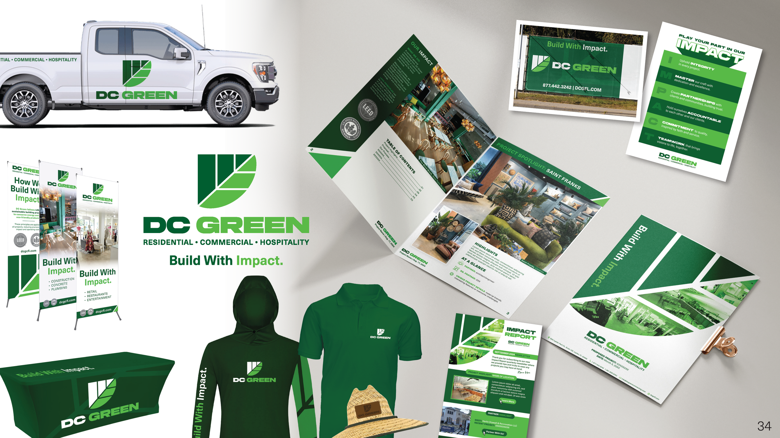
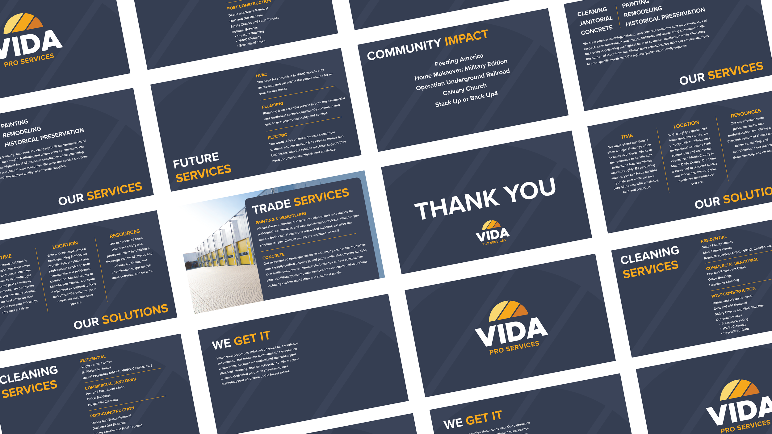
I partnered with designer McIver Crouch to reimagine the brand identity for DC Green, a South Florida-based construction company committed to sustainability and community-driven development. Our work included a full brand audit, logo redesign, typography system, collateral development, and messaging strategy. We introduced a modernized icon that symbolizes growth, adaptability, and DC Green’s eco-conscious ethos—anchored by a bold tagline and a refined visual system.
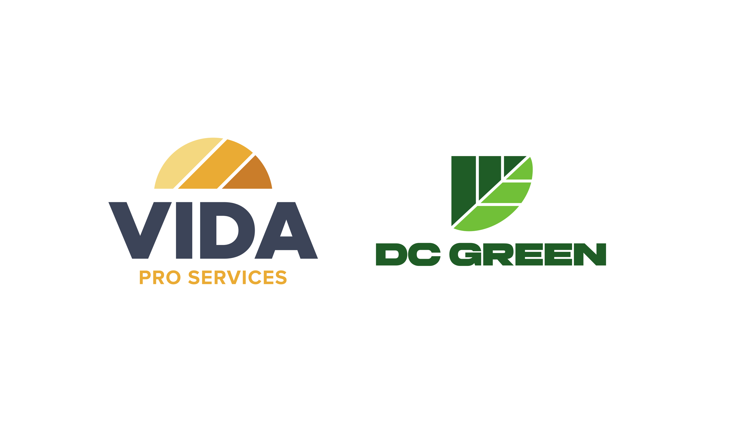
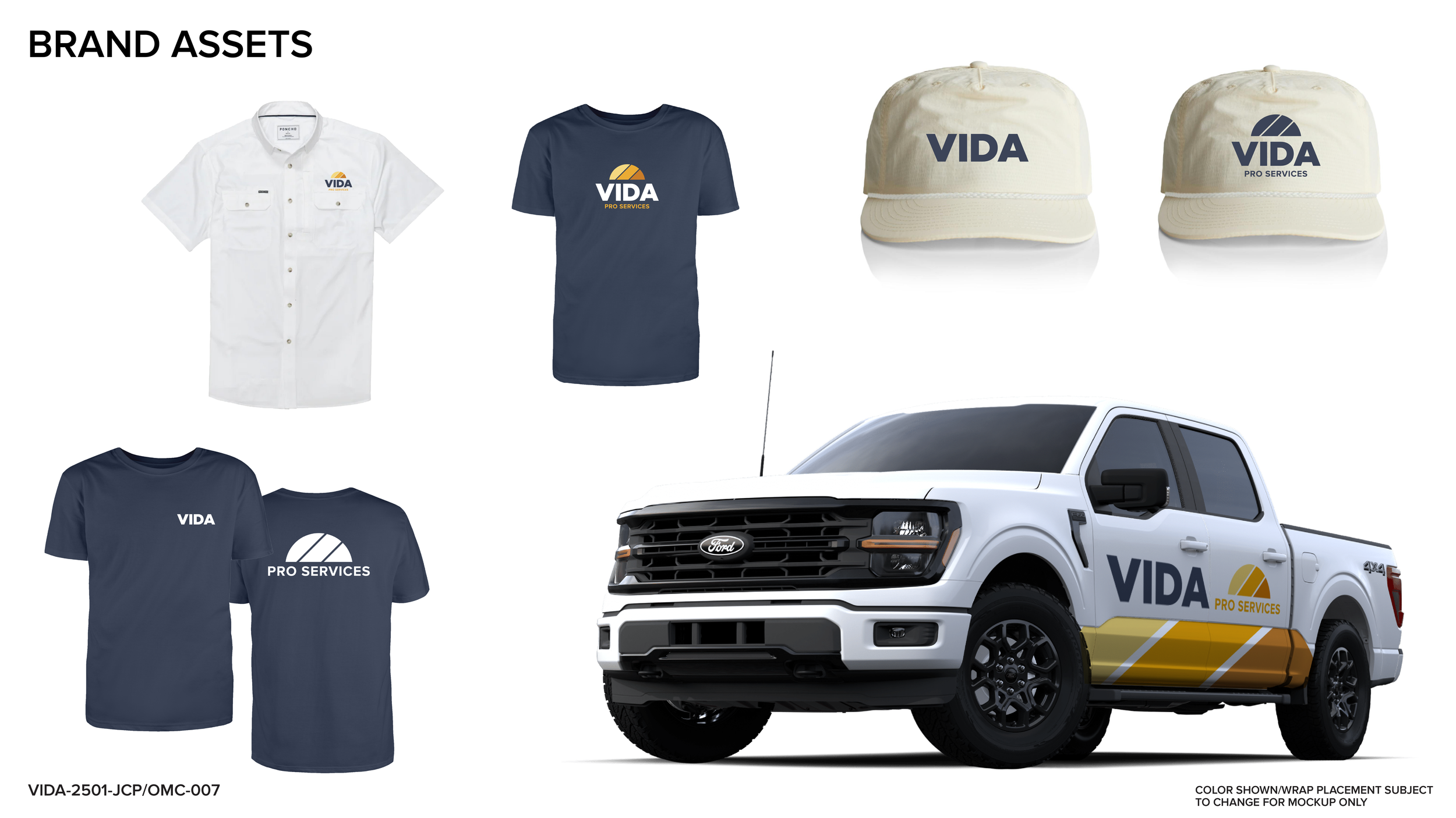
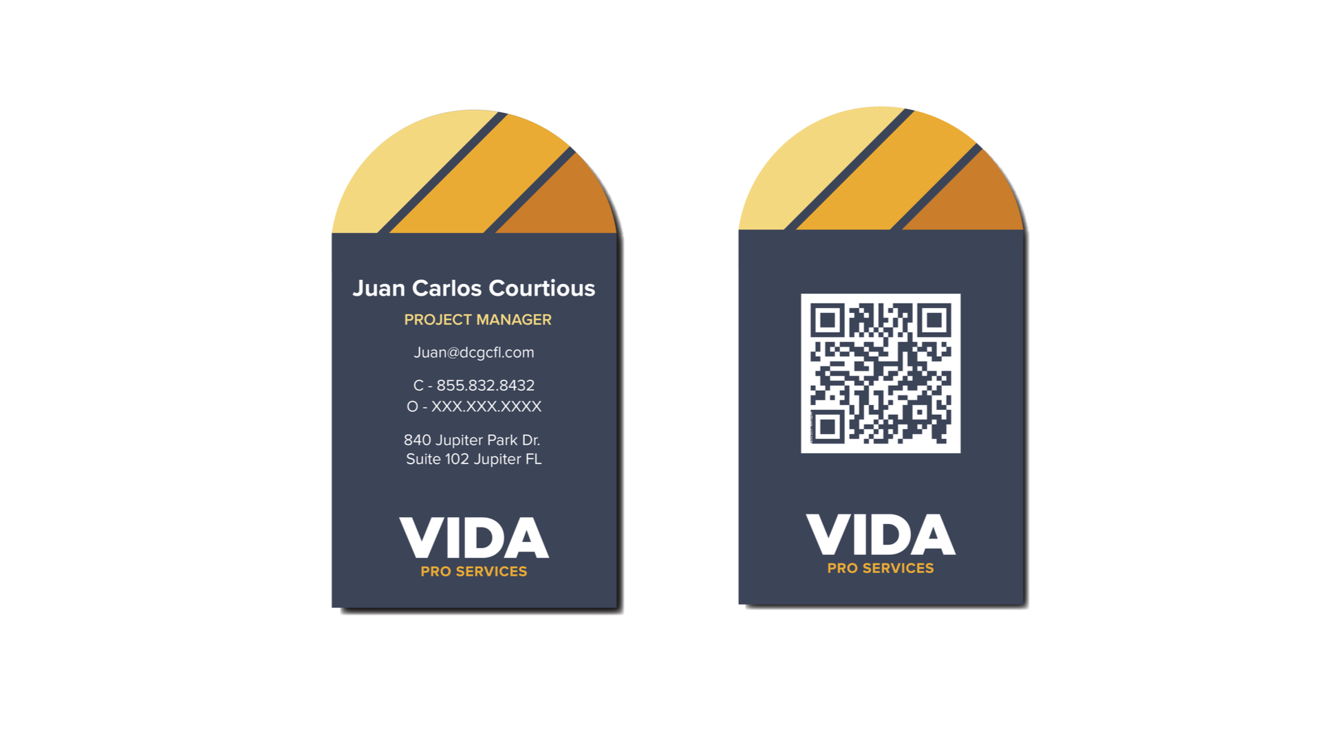
Alongside DC Green, we also developed a complementary but distinct brand for its sister company, Vida Pro Services. With a focus on empowering tradespeople through faith and integrity, we crafted a brand identity rooted in renewal and upward momentum. The result: two visually related but strategically unique brands, purpose-built to serve different audiences while maintaining cohesive brand equity across the family.
Deliverables included:
• Brand strategy & positioning
• Logo suite & iconography
• Color & typography systems
• Vehicle wraps, signage, apparel
• Internal communications & social templates


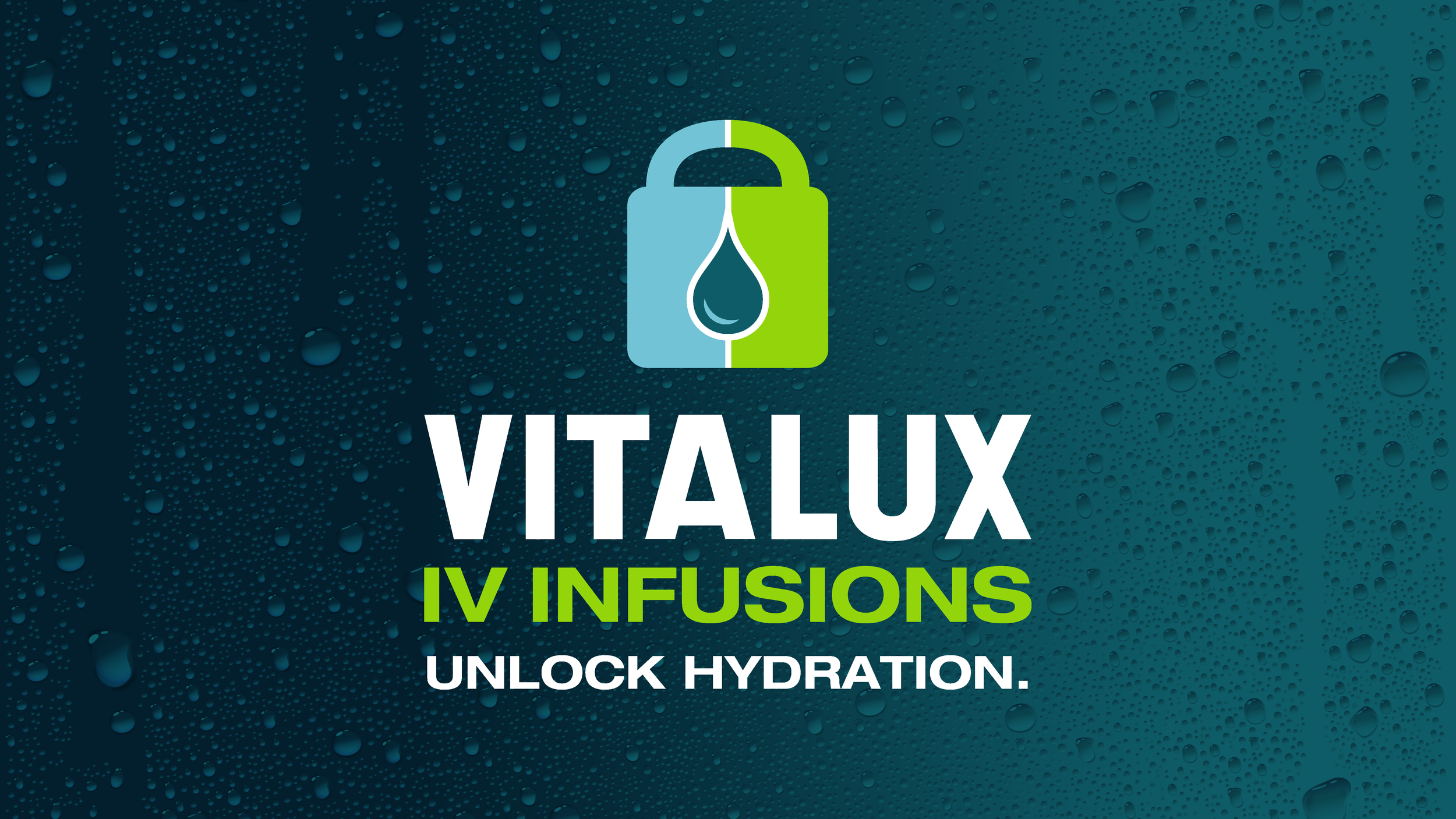
Create engaging imagery, along with strong messaging. This brand, for a mobile IV infusion bar, didn’t have a look or a tagline. In the creation of this brand, I wanted to entice the senses of thirst and feeling of cold, to mirror the receiving feeling of IV fluids. As a tagline should, the call to action encourages the consumer to engage with the brand.
Unlock a New Look.

Given One Chance.
In the creation of this brand, I was given a chance to create a sub-brand for a podcast company’s subscription access to content behind a paywall. Cover1 is a podcast out of Buffalo, New York that covers the Buffalo Bills. This was an incredible opportunity building branding to partner with the parent logo.
Collaborate.
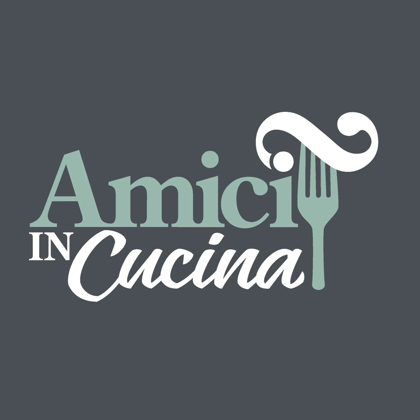
In a creative process, many artists in agency life take a stab at aesthetics for clients. This is an unpublished version of a brand that I wrote a unique concept and design for. The client owned a virtual cooking program taught out of Italy.
Description of Brand: Add a little zest to your already established skillset in the kitchen. In the 16th century, a musical technique was called a Gruppetto, known more commonly as a trill. This symbol allowed musicians an added creative freedom by taking a note up or down four times as a “trill” to stylize a musical piece. Maybe you’ve been to Italy, or maybe you have previous experience in Italian cooking. This program will allow you to add zest of technique to your established skillset.